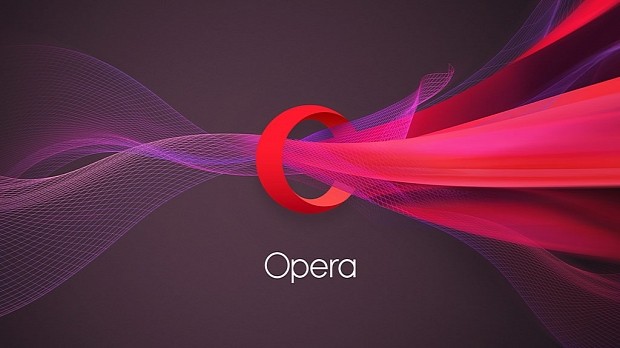
To celebrate its 20th anniversary, Opera Software, the company behind the Opera Web browser, has undergone a facelift and is now sporting a new logo.
While we've seen companies in the past change their logo's color and call it a makeover, Opera's new brand is generally different from what you remembered it to be like, even if its logo is still the same "O."
Opera's design team, led by Arnfinn Hushovd, the company's creative director, collaborated with two other companies, UK-based DixonBaxi and Anti from Norway, and the result is a 3D rendering of the O letter with a slight perspective, but an O that is totally different from what the company has been previously featuring.
Instead of the tall narrow O, you're now getting a perfect circle, meant to signify the company's complete arsenal of Web browsers and related services, covering everything from desktops to iOS and Android devices.
A new logo to better fit its broad spectrum of provided services
"We envision Opera’s new logo as a portal quickly connecting you with what you’re looking for on the web," said Sean D'Arcy, Opera's VP Global Marketing and Distribution. "The 3-dimensional “O” symbolizes a gateway that leads you to more: more content, more discoveries, more answers, more communication, more fun, more data savings, more of life – whatever you seek online, Opera helps you do more!"
The change is now only active on Opera's site and Opera Mini for iOS, but it will also roll out to the company's other services, which includes: Opera for Android, Opera Mini for Android, Opera Mini for Windows Phone, Opera for computers, Opera Mediaworks, Opera Max, and Opera Coast.
Earlier this August, a Reuters report revealed that Opera's board of directors was actively looking for buyers.

 14 DAY TRIAL //


