Windows 10 Mobile comes with significant improvements in terms of UI and usability, but this doesn’t necessarily mean that Microsoft got everything right on the first attempt.
And a recent reddit discussion shows that, when it comes to the in-call screen of Windows 10 Mobile, Microsoft fell short to deliver a refined experience in terms of both looks and features.
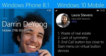
The photo you can see here and that was also published in the aforementioned thread is a comparison between the Windows Phone 8.1 and the Windows 10 Mobile call screens, with the latter supposed to look more modern and fresh and, at the same time, make more sense on an overhauled platform.
Not making the most of the available space
But as the annotations made on the photos suggest, the design of the UI fails to deliver what it was supposed to from the very beginning, and not only does it lack symmetry but it also wastes the available screen space and fills it with blank dark space.
The separator at the bottom of the window also makes little sense while the photo avatar of your contact is now smaller and placed in the top left corner, versus on half of the screen in Windows Phone. What’s more, the end call button is now placed at the bottom of the screen, only a few millimeters above the Windows key on Lumia phones, so you can always mistake one for another.
Certainly, with Windows 10 Mobile still a work in progress, Microsoft can further improve the design of the operating system as a whole and refine the experience we get in some specific parts, such as the call screen.
And yet, it remains to be seen how fast Microsoft can be with addressing these remarks, as Windows 10 Mobile is supposed to make its public debut sometime this month for Windows Phone devices.

 14 DAY TRIAL //