Microsoft has a lot to fix in Windows 10 and the update that’s expected to launch in October or November is supposed to do just that and bring new features on PCs and tablets, such as extension support for Edge browser.
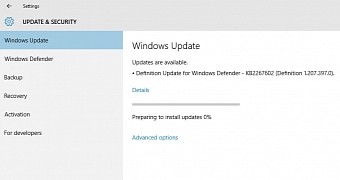
But in the meantime, Redmond’s taking care of the little things that matter, such as colors, personalization options, and the way updates are displayed in the Windows Update screen.
In Windows 10, Microsoft gave up on the old Windows Update section in Control Panel and moved it to Settings, which is the only destination for setting up your PC in the new OS. Windows Update, however, used an awkward way to display information on the patches that were about to be downloaded, and the available description didn’t use the available space in the active window.
Instead, Microsoft broke the description in several lines, which forced users to scroll a lot when they had to install more updates.
Windows 10 build 10547 to the rescue
The company has silently changed that in Windows 10 build 10547 and now the update description actually uses the available space in the window. If you resize the window, though, the text is rearranged, so it’s again broken into multiple lines to look well and remain easy to read.
A Microsoft employee confirmed the change, although there is no official announcement for this:
“Yeah - I reached out to the settings team after the original post, and turned out they were already totally on it as a result of feedback from other channels. Good on them, really was a great flight for updates based on feedback,” reddit user jenmsft, who’s a Microsoft employee, explained in a short message.
Keep in mind that this change is only available in build 10547 for now and is expected to debut in the stable version of Windows 10 in the coming weeks.

 14 DAY TRIAL //