14 DAY TRIAL //
 Google’s search is the original product which the tech behemoth managed to build upon in order to make a name for itself in the tech industry.
Well, Google is keen on tweaking and improving its search interface and sometimes it does so without making a big fuss about it.
This week we’ve noticed that a few subtle changes have been applied when users search from Chrome on a mobile device.
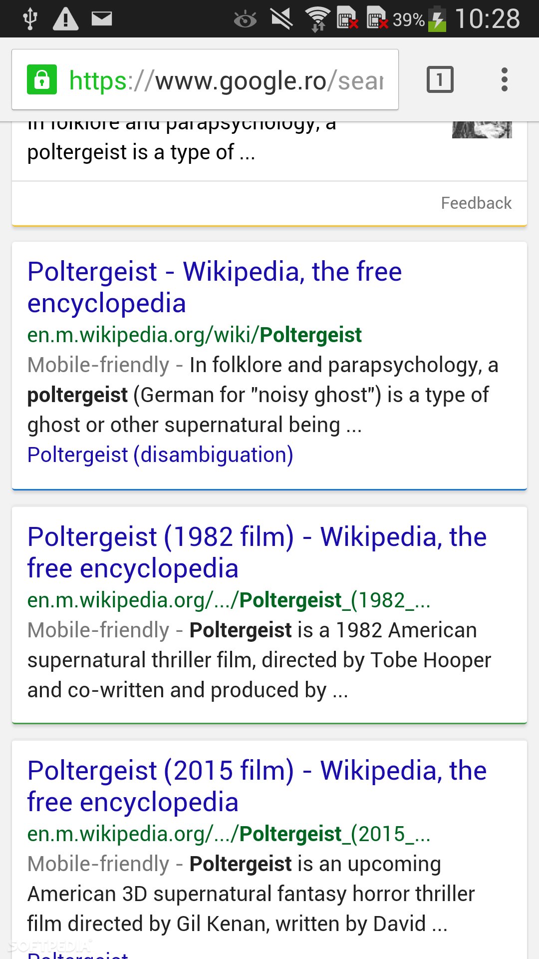
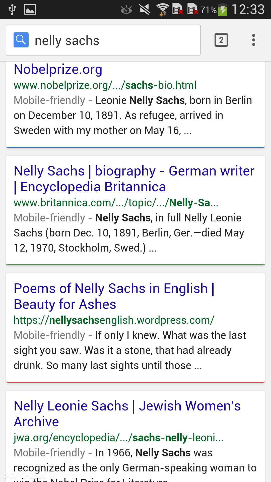
As we have demonstrated in the gallery, instead of showing results separated by a gray, bland line, you’re now getting a fresh layout which puts different results in their own cards, underscored by a colored line (Google’s primary brand colors include blue, green, yellow and red).
The only caveat is that you’ll probably end up seeing fewer results on one page using the Chrome approach, so you’ll end up scrolling more.
As far as we’re concerned, the new layout looks quite nice and we don’t mind scrolling through the cards. Although we’re pretty curious whether the colors indicate a certain type of results. For example, the red ones might pinpoint towards the more meaningful ones, although it’s just a guess.
You can go ahead and try out Chrome search right now and tell us what you think of the new display system. Love it or hate it?